
 Families
 New Families
 Alumni

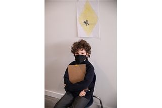
As part of their IB PYP Unit of Inquiry “How we express ourselves,” students in Grade 3 have been learning how signs and symbols facilitate local and global communication. They used their knowledge to create their own signs and then shared them with other students in the Junior School.
The students studied “how icons convey meaning,” “how design elements of signs and symbols support communication” and “how we interpret and respond to signs and symbols to navigate the world.” Students then used patterns, specific colours and shapes to create their desired signs.
“I used a red circle with a diagonal cut along with it, and a person climbing a tree for it to mean ‘No climbing trees,’” explained Wyatt. “I used the red because it means you should really listen to this sign. Making signs takes a lot of hard work.”
Zemirah created a sign that was meant to remind people to lock the door at home.
“I used a key, hand, door and a green square as my shape,” she explained. “I used the square because it shows an informational sign, and that’s what mine was. I learned while making signs, it has to make sense like if it’s a caution sign you can’t just have any colour. Also, your sign can’t be complicated, or else it will take a while for people to understand it.”
Students and staff throughout visited the Grade 3 classrooms throughout the day to try and decipher what the signs meant. The students then included a tally to see how many people guessed the correct answer. If there were a majority of wrong answers, students then ended up reflecting on ways they could have made their signs more clear.
Kristin created a sign that indicated a catwalk was in the area.
“My sign had cats walking on a crosswalk,” she said. “I made it into a rhombus shape because it represents caution. I also used yellow because it also means caution. I learned from making these signs that it’s important to use colours that represent what you mean instead of using just purple and blue.”
Noah made another caution sign that warned people about sharks in the water.


“The yellow, shape and exclamation mark added into the sign all indicated caution,” he said, adding that less detail is better. “You can’t add too much detail and not colours. I originally had blue on my first draft, but I redid it to stay with neutral colours.”
Way to go Grade 3s for showing us your creative signs!
Related Posts
Four Effective Strategies for Mathematics Education: Insights from Mr. Pat Giommi
As a seasoned mathematics teacher, I’ve witnessed countless students grow and succeed in their mathematical journeys. Through my experience,...
GNS Offering Orton-Gillingham Summer Reading Camps for Grade 1 and 2 Students
GNS is excited to offer Orton-Gillingham reading camps this summer, promising a fun and transformative experience for young readers....
Career Expo Highlights Future Possibilities for GNS Students
The morning began with a keynote speaker from the University of Victoria, Dr. Lisa Surridge, who shared advice on...